

GRIDNET OS Exchange — Complete Technical Analysis Toolkit
Preludium: Why We Built an Entire Charting Platform from Scratch
The Foundation: What TradingView Lightweight Charts Actually Provides
Let us be direct about what we started with. TradingView Lightweight Charts is an open-source library that provides basic chart rendering and nothing else. It can draw candlestick series on a time axis. It can draw line series. It handles zooming, scrolling, and the price/time scales. That is where its capabilities end.
There are no drawing tools — not a single trend line, not a Fibonacci retracement, not a rectangle. There are no technical indicators — no RSI, no MACD, no moving averages. There is no multi-pane system for oscillators. There are no advanced chart types like Heikin Ashi or HLC Area. There is no depth chart, no order visualization, no touch interaction model. The library renders price data on a canvas. Everything else — everything documented in this article — was engineered from zero.
Why Not License TradingView Pro?
The obvious question: why not simply license TradingView’s professional charting library? Hyperliquid’s own front-end at app.hyperliquid.xyz does exactly that — it embeds TradingView’s paid enterprise widget, which comes with the full suite of drawing tools, indicators, and chart types out of the box. For a centralized exchange running on a single server deployment, a standard enterprise license covers the use case perfectly.
GRIDNET OS is fundamentally different. The Exchange UI dApp is not served from a single server. It is not hosted behind a load balancer at a known domain. The entire application — every line of HTML, CSS, and JavaScript — is delivered by a truly decentralized network of GRIDNET OS nodes. Any node in the network can serve the complete Exchange interface to any user. There is no single origin server. There is no central point of distribution.
TradingView’s licensing model is built around the assumption of a centralized deployment: one company, identifiable servers, a countable number of instances. The GRIDNET OS architecture — where the Exchange dApp propagates across an open network of sovereign nodes — does not fit within the boundaries of any conventional software license. We could not license our way to a solution. We had to build one.
What We Built: The Scope
The scale of what was constructed on top of that minimal rendering foundation is substantial:
- 87 professional drawing tools across 15 categories — from simple trend lines to five-point harmonic patterns like XABCD and Cypher, seven-point Head and Shoulders, and complete Elliott Wave notation systems. Every tool follows a CAD-quality interaction model: multi-stage click placement with live rubber-band preview, anchor point adjustment, magnet snapping to OHLC values, and confirmation.
- 90 technical indicators with complete mathematical implementations — every computation runs client-side in pure JavaScript with zero server dependencies. Moving averages (SMA, EMA, WMA, DEMA, TEMA, HMA, VWMA, ALMA, SMMA, McGinley, LSMA, Guppy), trend systems (Supertrend, Ichimoku Cloud, Parabolic SAR, Williams Alligator), 28 oscillators (RSI through Ultimate Oscillator), 11 volume studies, 15 volatility measures, and more.
- Dynamic multi-pane indicator system — each oscillator-type indicator automatically creates its own dedicated chart pane with independent scaling, axis labels, and interactivity. Enable RSI and MACD simultaneously, and two new panes appear below the price chart. Remove one, and the layout reflows. No manual configuration required.
- 12 chart types — the open-source library provides basic candlestick and line rendering. We built Bars, Hollow Candles, Step Line, Area, HLC Area, Baseline, Columns, High-Low, and Heikin Ashi (with its averaged OHLC computation) on top of the library’s primitive series types.
- Canvas-based market depth chart with multi-resolution zoom — a real-time visualization of the order book that renders bid and ask depth as filled area curves, with interactive hover inspection.
- Order visualization on price charts — open orders appear as interactive horizontal lines directly on the chart. Drag an order line to modify its price. The visual feedback loop between the chart and the order book is immediate.
- Per-pair drawing persistence — every drawing is stored per trading pair. Switch from BTC/USDC to ETH/USDC and back: your analysis survives. Off-screen drawings extrapolate correctly when the visible range shifts.
- Full mobile touch support — all 87 drawing tools work on touch devices with 44px minimum touch targets, gesture recognition for multi-point tools, and touch-optimized context menus.
The Decentralization Advantage
Every GRIDNET OS node in the network serves the complete Exchange UI dApp — all 87 drawing tools, all 90 indicators, all 12 chart types. There is no CDN. There is no origin server. There is no single point of failure. The charting experience is identical whether accessed from any node in the network, because every node carries the full application.
This architectural reality is not just a resilience feature — it is a foundation for capabilities that no licensed charting solution could ever provide:
- Collaborative charting and group trading — Multiple traders drawing on the same chart in real-time, synchronized through GRIDNET OS’s Swarms API. The decentralized messaging infrastructure that powers GRIDNET OS group chat is already in place; extending it to shared chart annotations is a natural evolution. Imagine a trading floor where every participant sees every trend line, every Fibonacci level, every annotation — live, as it is drawn.
- AI-assisted pattern recognition — Integration with GRIDNET OS’s AI capabilities to automatically detect chart patterns — head and shoulders formations, double tops, flag breakouts — and overlay them as suggested drawings. Because we own the entire rendering stack, the AI can draw directly on the chart canvas with the same tools a human would use.
- Cross-chain charting — Chart assets across multiple blockchains simultaneously on a single canvas. Overlay BTC from one chain against ETH from another. No licensed widget can do this because no single exchange has the data; GRIDNET OS’s decentralized architecture can aggregate across sources.
- Community-shared analysis — Traders publish their complete chart analysis — drawings, indicators, annotations — through the GRIDNET OS network. Other traders subscribe, fork, and build upon shared analyses. A decentralized marketplace of technical analysis, with provenance and attribution built into the network layer.
- Custom indicator scripting via GridScript — Allow users to define custom indicators using GRIDNET OS’s native scripting language. Because every indicator computation already runs client-side in pure JavaScript, extending the system with user-defined formulas is an engineering task, not an architectural one.
None of these capabilities are possible with a licensed third-party charting widget. They require ownership of the entire stack — from the canvas rendering layer through the indicator computation engine to the drawing interaction model. That is what we built.
Introduction
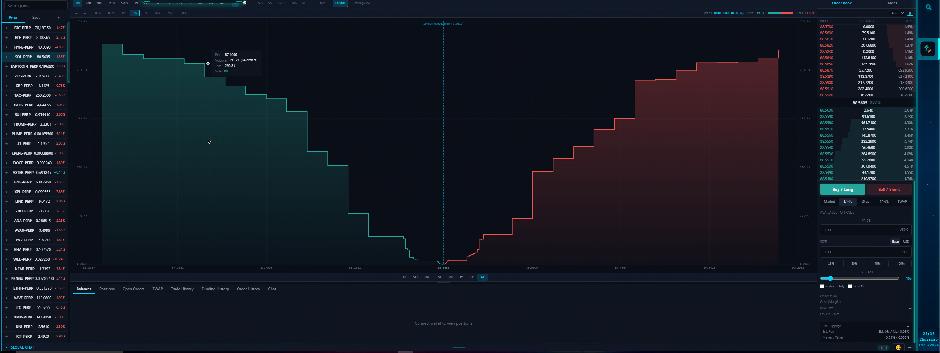
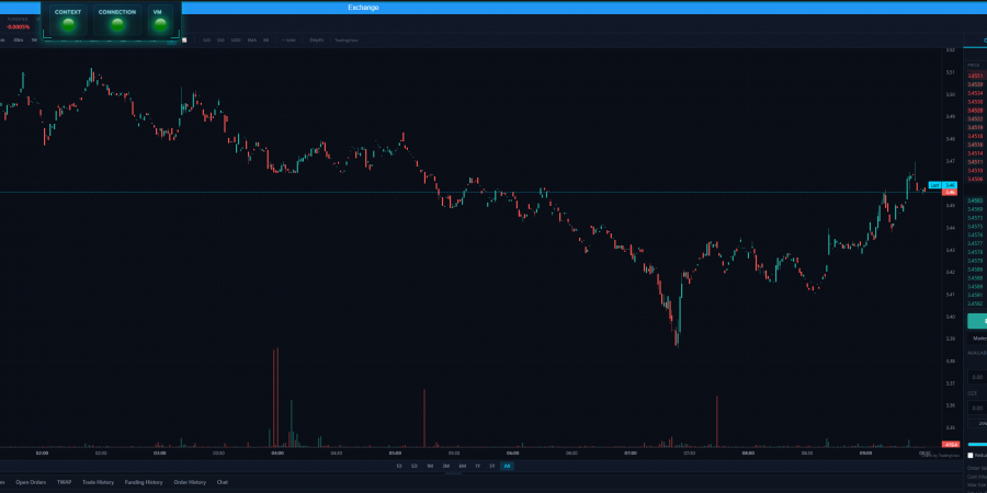
Proper Market Depth charts finally arriving to a Hyperliquid based exchange.
The GRIDNET OS Exchange dApp is a professional cryptocurrency trading interface running natively inside the GRIDNET OS decentralized operating system. Powered by Hyperliquid’s HyperCore — a fully on-chain order book with sub-second settlement — the Exchange UI delivers an institutional-grade charting experience that rivals standalone platforms costing hundreds of dollars per month.
Every charting tool documented here is custom-built from the ground up on top of TradingView Lightweight Charts v5, the open-source library that handles only the base candlestick rendering. The drawing engine, the 87 interactive tools, the 90 technical indicators with their mathematical computations, the multi-pane oscillator system, and the canvas-based depth chart are all original GRIDNET OS code — delivering TradingView Pro-level functionality without licensing fees, subscription gates, or third-party dependencies.
This article serves as the definitive reference for every analysis tool available in the Exchange dApp. Whether you are a day trader hunting for momentum setups, a swing trader mapping Fibonacci retracements, or a quantitative analyst layering oscillators for confluence — this is your complete toolkit.
Why Not Simply Use Hyperliquid’s Official Trading App?
Hyperliquid: Permissionless Blockchain, Permissioned Exchange
While Hyperliquid markets itself as a permissionless blockchain — and HyperCore indeed is — the exchange frontend at app.hyperliquid.xyz operates like a centralized exchange in critical ways that directly contradict the permissionless ethos.
Token Listing. When you deploy a HIP-1 token on HyperCore — even after winning a Dutch auction for a ticker spot — your token is not visible on the public default list of tradable assets on app.hyperliquid.xyz. It is entirely up to Hyperliquid’s administrators whether they choose to make your token visible to the general public. By default, your HIP-1 token remains hidden behind filters, and Hyperliquid has indicated no intention to change this behavior.
Deposit & Withdrawal. Even if your HIP-1 token wins a Dutch auction and gets a ticker, Hyperliquid will not enable deposit and withdrawal functionality for your token from their default user interface. They will tell you that HyperCore is permissionless — but the exchange interface is decidedly not. You end up with a token ticker on a permissionless blockchain but no way for users to deposit or withdraw it through the official exchange UI.
The Result. You have a permissionless blockchain paired with a permissioned exchange frontend. The blockchain does not gatekeep — but the user interface does.
GRIDNET OS Exchange: Truly Permissionless, End to End
This is precisely why we built the GRIDNET OS Exchange. We are providing our own exchange service atop Hyperliquid’s HyperCore where the permissionless promise extends from the protocol layer all the way to the user interface:
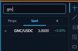
- ALL HIP-1 tokens are listed by default — no waiting for approval, no Dutch auction gatekeeping at the UI level, no central authority deciding whether your token deserves to be visible to traders.
- Full deposit and withdrawal support for any HIP-1 token — from Arbitrum, HyperEVM, and the GRIDNET OS blockchain via our multi-route bridge infrastructure.
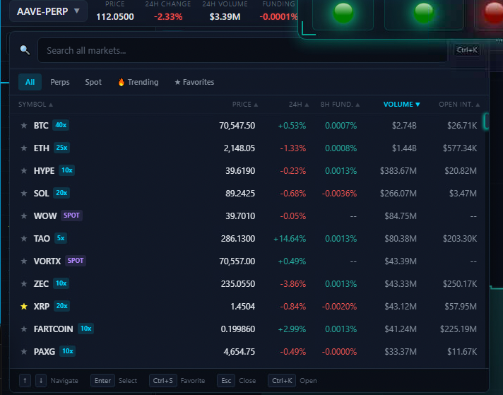
- All trading pairs Hyperliquid supports — perpetuals, spot, every asset — accessible without artificial filtering.
- Support for all Hyperliquid spot and derivatives markets — the complete HyperCore trading engine, not a curated subset.
Beyond Trading: A Social Trading Ecosystem
The GRIDNET OS Exchange goes beyond removing gatekeeping. We are building a complete decentralized trading ecosystem.
End-to-End Encrypted Group Chats. Powered by our WebRTC Swarms research — published academic work on decentralized real-time communication — the Exchange provides:
- A global chat room — entirely decentralized and encrypted, always connected.
- Per-trading-pair chat rooms — each trading pair has its own dedicated chat where traders can discuss, share analysis, and coordinate.
- Future: collaborative charting where multiple traders can draw on the same chart simultaneously via the Swarms API.
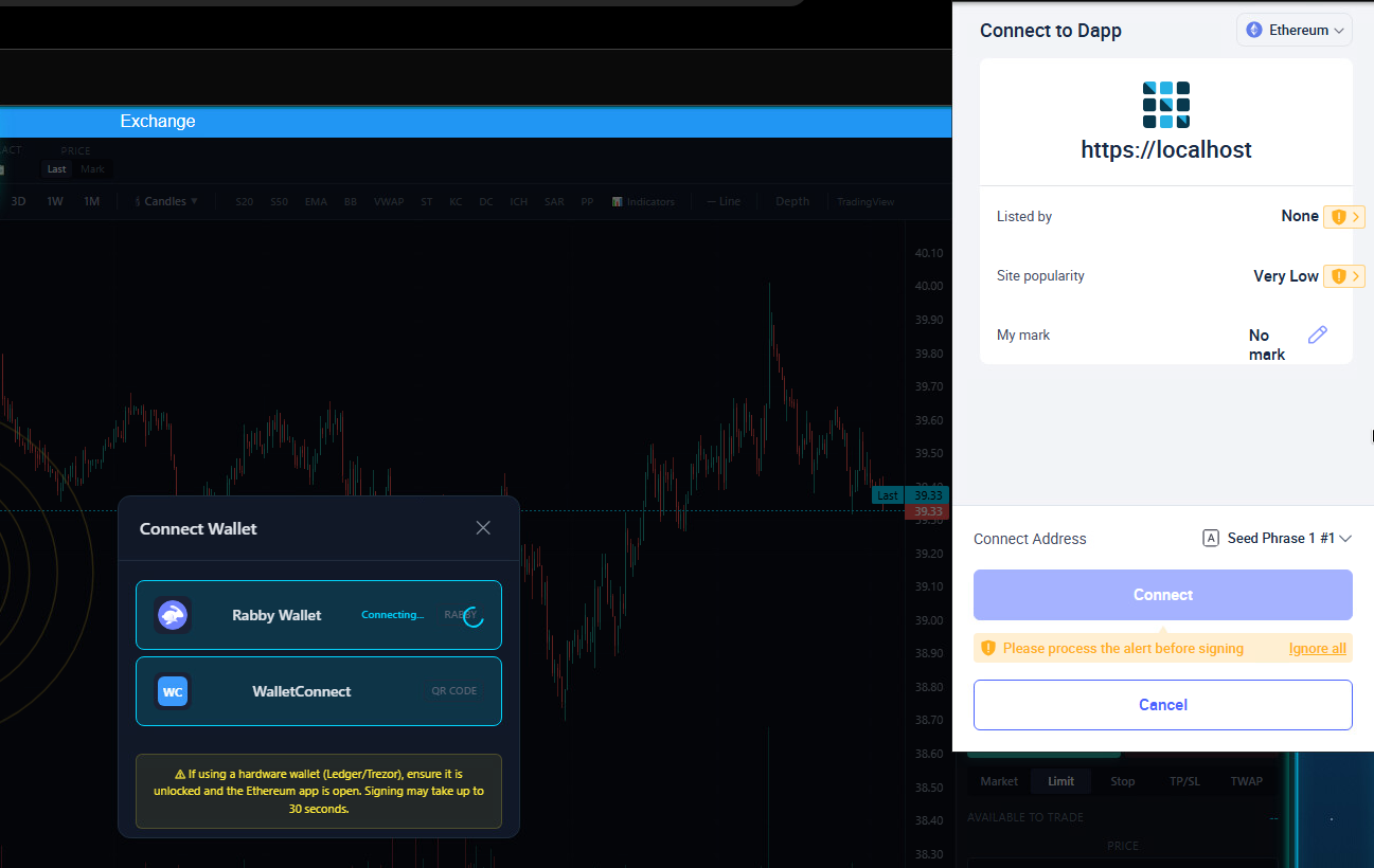
Wallet Integration. Out-of-the-box support for:
- Rabby Wallet (browser extension) with EIP-6963 auto-detection.
- WalletConnect (QR code pairing for mobile wallets).
- Hardware wallet support (Ledger, Trezor) via Rabby’s hardware wallet bridge with 60-second signing timeout.
The True DEX Promise. The GRIDNET OS Exchange benefits from Hyperliquid’s entire trading ecosystem — the liquidity, the order matching engine, the settlement — while providing what Hyperliquid’s own frontend refuses to: a truly decentralized exchange experience where everything is actually permissionless. From winning a Dutch auction, to having your token listed and visible to every trader, to enabling deposits and withdrawals — no central authority decides what you can or cannot trade.
Every node in the GRIDNET OS network serves the complete Exchange UI dApp. There is no single server that can be pressured to delist a token, hide an asset, or block a withdrawal. The decentralized architecture ensures that the permissionless promise of the blockchain extends all the way to the user interface.
Section 1: Chart Types (12)
The Exchange dApp supports twelve distinct chart visualization modes, each tailored to different trading styles and analysis approaches. Chart types are divided into two rendering families: OHLC-based types that display open, high, low, and close data per candle, and value-based types that plot a single price point per time period.
OHLC-Based Chart Types
| Chart Type | Data Format | Description | Best For |
|---|---|---|---|
| Bars | OHLC | Traditional OHLC bar chart. Each bar shows a vertical line from low to high, with small horizontal ticks marking the open (left) and close (right). Up bars render in green (#26a69a), down bars in red (#ef5350). | Traders who prefer a clean, uncluttered view of price action without the visual weight of filled candle bodies. Popular among futures and forex traders. |
| Candles | OHLC | Standard Japanese candlestick chart — the default and most widely used chart type. Each candle has a filled or hollow body spanning open-to-close, with wicks extending to the high and low. Bullish candles are green, bearish candles are red. | The universal choice for pattern recognition. Candlestick patterns — doji, hammer, engulfing, morning star — are the foundation of technical analysis. |
| Hollow Candles | OHLC | A variation of candlesticks where bullish candles are rendered with a transparent body and green border, while bearish candles remain filled in red. The wicks follow the same color scheme. | Adds a visual dimension: hollow bodies emphasize bullish momentum by making the candle feel “lighter,” making it easier to scan for trend direction at a glance. |
| High-Low | OHLC | Renders only the high-to-low range as a vertical bar for each time period, omitting open and close data. Shows the full volatility range without directional bias. | Volatility analysis and range-based trading. Useful for identifying expansion and contraction cycles without the noise of open/close levels. |
| HLC Area | OHLC | Combines High-Low-Close data with a filled area visualization. The area between the high and low is filled with a semi-transparent gradient, while the close price is drawn as a line. Creates a smooth, flowing view of price action. | Swing traders who want to see both the volatility range and the closing trend simultaneously. The filled area makes support/resistance zones visually obvious. |
| Heikin Ashi | OHLC (computed) | A modified candlestick type that uses averaged values instead of raw OHLC data. The Heikin Ashi close is calculated as (Open+High+Low+Close)/4, the open as the average of the previous Heikin Ashi open and close, and the high/low as the maximum/minimum of the actual high, Heikin Ashi open, and Heikin Ashi close. This smoothing reduces noise and makes trends more visually apparent. | Trend-following traders. Heikin Ashi excels at showing the “true” trend by filtering out intra-bar noise. A series of green hollow candles signals strong uptrend; red filled candles signal strong downtrend. Transitions between colors mark potential reversals. |
Value-Based Chart Types
| Chart Type | Data Format | Description | Best For |
|---|---|---|---|
| Line | Close | A simple line connecting the close price of each period. The cleanest possible representation of price movement, stripping away all intra-bar information. | Long-term trend analysis, identifying major support/resistance levels, and creating clean chart snapshots for presentations or reports. |
| Line with Markers | Close | Identical to the Line chart but with circular markers plotted at each data point. The markers make individual periods identifiable even when zoomed out. | Identifying specific price points of interest within a trend. Useful when you need to reference exact candle-level data on a line chart. |
| Step Line | Close | Connects close prices using horizontal and vertical line segments instead of diagonal lines. Price moves are displayed as discrete “steps” — each period holds its value until the next period changes it. | Strategies based on discrete price levels. Makes it visually clear when a breakout occurs because the horizontal segment represents the “holding” period before the next move. |
| Area | Close | A line chart with the area below the line filled with a semi-transparent gradient. Creates a visually prominent representation of the price trend with an emphasis on the magnitude of price relative to the bottom of the chart. | Portfolio dashboards, overview charts, and situations where you want the “weight” of the price to be visually apparent. The filled area makes it easy to compare relative price levels across different time periods. |
| Baseline | Close | A line chart split at a configurable baseline value (typically the first visible close price). The area above the baseline is filled in green, while the area below is filled in red. This dual-color scheme immediately shows periods of gain versus loss relative to the baseline. | Performance tracking relative to an entry price. Set the baseline to your buy price and instantly see all periods where the asset traded above (profit) or below (loss) that level. |
| Columns | Close | Renders each period’s close price as a vertical column extending from the bottom of the chart. Column height represents the price value, creating a bar-graph-style visualization of price action. | Volume-style visualization of price. Useful for comparing relative price magnitudes across periods and for overlaying with actual volume data in multi-pane setups. |
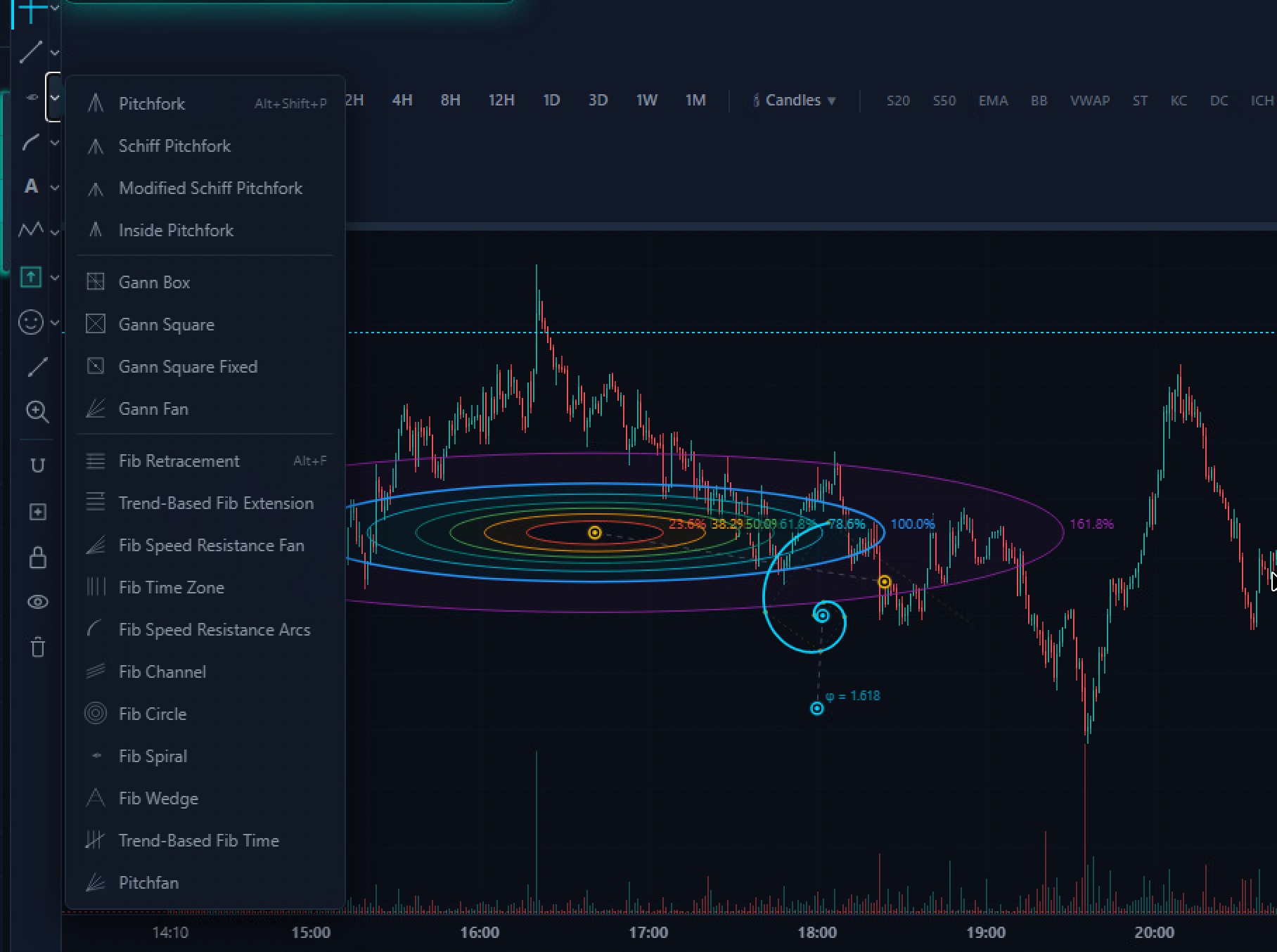
Section 2: Drawing Tools (87 Tools, 15 Categories)
The Exchange dApp’s drawing engine is a custom canvas overlay system that renders all drawings on a transparent layer above the price chart. Every drawing tool follows a consistent CAD-style interaction model: you select a tool, click on the chart to place anchor points, and the drawing is constructed between those points. Multi-point tools show a real-time preview as you move your mouse before clicking the next point.
Drawings are persisted per trading pair — switch from BTC/USDC to ETH/USDC and back, and your BTC drawings are exactly where you left them. The system supports selection, drag-to-move, deletion, locking, and visibility toggling for all drawing types.
Category 1: Cursors (6 tools)
Cursor tools control the mouse behavior and interaction mode on the chart canvas. They are the foundation of the drawing system — you are always in one cursor mode or another.
| Tool | Clicks | Shortcut | Description |
|---|---|---|---|
| Cross | — | Ctrl+Shift+H |
The default crosshair cursor. Displays vertical and horizontal guide lines that follow the mouse, intersecting at the current price and time. Essential for precise price/time reading across the chart. Pressing Ctrl+Shift+H returns you to crosshair mode from any drawing tool. |
| Dot | — | — | A minimal cursor that shows only a small dot at the mouse position. Reduces visual clutter when you want to inspect the chart without the full crosshair overlay. Useful during screenshot capture or presentation mode. |
| Arrow | — | — | The standard pointer cursor. Used for selecting, dragging, and interacting with existing drawings on the chart. Click a drawing to select it (shows control handles), then drag to reposition. Essential for editing drawings after placement. |
| Eraser | 1 | — | Click any drawing to instantly delete it. A fast alternative to selecting a drawing and pressing Delete. The eraser cursor provides visual feedback — hover over a drawing and it highlights before deletion. |
| Demonstration | — | — | A pointer cursor with a visual indicator, designed for screen sharing and presentation scenarios. The enlarged cursor is easier for remote viewers to follow during live demonstrations of chart analysis. |
| Magic | — | — | An intelligent cursor mode that provides context-sensitive interaction. Hovering over chart elements triggers enhanced tooltips and highlighting, making it easier to explore complex chart setups with many overlapping drawings and indicators. |
Category 2: Trend Line Tools (15 tools)
Trend line tools are the backbone of technical analysis — lines that connect price points to identify trends, support, resistance, and channels. Every tool in this category draws some form of straight line or set of parallel lines on the chart.
| Tool | Clicks | Shortcut | Description |
|---|---|---|---|
| Trend Line | 2 | Alt+T |
The most fundamental drawing tool. Click to set a start point, move the mouse to see a preview line, then click again to set the end point. The line renders in cyan (#00d4ff) with control points at each end. Used to mark trendlines, support/resistance boundaries, and price targets. The workhorse of chart analysis. |
| Info Line | 2 | — | A trend line that automatically displays measurement information alongside it — price difference, percentage change, and number of bars between the two points. Functions identically to a trend line for drawing purposes, but the attached data label makes it invaluable for quick measurement without switching to the Measure tool. |
| Trend Angle | 2 | — | Draws a trend line and displays the angle of inclination relative to the horizontal axis. A 45-degree angle represents a 1:1 price-to-time ratio. Steep angles indicate aggressive momentum; shallow angles indicate consolidation. Used by Gann theory practitioners and traders who monitor the “speed” of price movement. |
| Horizontal Line | 1 | Alt+H |
Click once to place an infinite horizontal line at the clicked price level. The line extends across the entire visible chart and beyond. The single most common tool for marking support and resistance levels, take-profit targets, stop-loss levels, and round-number psychological barriers. |
| Horizontal Ray | 1 | — | A horizontal line that extends only in one direction (rightward) from the anchor point. The left end is anchored at a specific time, making it useful for marking levels that only became significant after a certain event — for example, a support level established after a breakout. |
| Vertical Line | 1 | Alt+V |
Click once to place an infinite vertical line at the clicked time point. Extends from the top to the bottom of the chart. Used to mark events — earnings releases, protocol upgrades, halving dates, or any time-based reference point. Multiple vertical lines create time-based zones. |
| Cross Line | 1 | — | Places both a horizontal and vertical line simultaneously, forming a cross at the clicked point. Combines the functionality of Horizontal Line and Vertical Line in a single click. Marks a specific price-at-time coordinate — useful for pinpointing exact pivot points, trade entries, or notable candles. |
| Parallel Channel | 3 | — | Creates two parallel lines forming a price channel. Click to set the first point of the base line, click again to complete the base line, then click a third time to set the channel width. The second line is automatically kept parallel to the first. Used to identify trending channels where price bounces between upper resistance and lower support. |
| Disjoint Channel | 4 | — | A channel defined by two independent line segments that are not required to be parallel. Four clicks define the endpoints of both lines independently. Used when a channel’s upper and lower boundaries converge or diverge — such as wedge patterns, broadening formations, or asymmetric channels. |
| Flat Top/Bottom | 3 | — | Creates two horizontal lines connected by vertical boundaries. First click sets one horizontal level, second click sets the opposite level, third click sets the width. Forms a rectangular zone that highlights a consolidation range or accumulation/distribution zone with clear upper and lower bounds. |
| Regression Trend | 2 | — | Draws a linear regression line between two time points, automatically calculating the best-fit line through the price data. Two additional parallel lines are drawn at one standard deviation above and below. Shows the statistical trend and the normal volatility envelope around it. Price breaking outside the deviation bands signals unusual momentum. |
| Ray | 2 | — | A line that starts at the first click point and extends infinitely through and beyond the second click point. Unlike a trend line (which has two endpoints), a ray has one endpoint and one direction. Used for projecting trendlines into the future — the line continues past your second anchor point indefinitely. |
| Extended Line | 2 | — | A line that extends infinitely in both directions through the two clicked points. Like a ray but extending past both anchor points. Useful when a trend line has significance on both sides of your visible chart — for example, a major diagonal support line that has been respected both before and after the current price range. |
| Arrow | 2 | — | A directional line with an arrowhead at the second click point. Visually indicates the direction of expected price movement. Used for annotating trade plans — “price is expected to move from A to B” — and for indicating entry/exit directions in chart analysis notes. |
| Trend Line with Breaks | 2 | — | A trend line that automatically detects and marks points where price breaks through it. After drawing the line, the system identifies candle closes beyond the line and renders break indicators. Essential for breakout trading — it answers the question “where exactly did this trendline fail?” without manual inspection. |
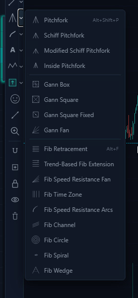
Category 3: Gann and Fibonacci (21 tools)
This category combines three families of tools based on classical mathematical frameworks used in technical analysis: Pitchfork median-line analysis, Gann geometric theory, and Fibonacci ratio analysis. These tools generate complex multi-line drawings from a few anchor points.
Pitchfork Tools (4)
| Tool | Clicks | Shortcut | Description |
|---|---|---|---|
| Pitchfork | 3 | Alt+Shift+P |
Andrews’ Pitchfork: a three-pronged median-line tool. The first click sets the handle (a significant pivot), and the next two clicks define the endpoints of a retracement wave. The tool draws a median line from the handle through the midpoint of the two endpoints, with two parallel outer lines through the endpoints. Price tends to gravitate toward the median line and reverse at the outer boundaries. One of the most powerful trend-following tools in technical analysis. |
| Schiff Pitchfork | 3 | — | A modified version of Andrews’ Pitchfork where the handle point is shifted to the midpoint between the original handle and the first reaction point. This adjustment makes the pitchfork less steep and often provides a better fit for the actual price channel, especially in strong trends where the standard pitchfork may be too aggressive. |
| Modified Schiff Pitchfork | 3 | — | Further modifies the Schiff variant by calculating the handle offset differently, producing a pitchfork that sits between the standard and Schiff versions in terms of angle. Provides an alternative fit when neither the standard nor the Schiff pitchfork aligns well with the observed price action. |
| Inside Pitchfork | 3 | — | Constructs the pitchfork with the outer lines positioned between the median line and the standard pitchfork boundaries. Creates a tighter channel that represents the “inner” trading range. Useful when price is consolidating within the larger pitchfork structure and you want to identify the more probable bounce zones. |
Gann Tools (4)
| Tool | Clicks | Description |
|---|---|---|
| Gann Box | 2 | A rectangular grid defined by two corner clicks. The box is subdivided by diagonal lines (corner-to-corner) and horizontal/vertical midpoint lines, creating a matrix of geometric relationships. Price often reacts at the intersection points of these internal lines. Based on W.D. Gann’s theory that price and time are geometrically related. |
| Gann Square | 2 | A square grid with both diagonal crosses (X pattern). Two clicks define opposite corners of the square, and the tool renders the four diagonals and midpoint lines. The intersections represent key support/resistance nodes where price-time balance points converge. |
| Gann Square Fixed | 1 | A single-click Gann Square that uses a fixed size centered on the clicked point. The square auto-sizes based on the visible chart scale, providing an instant geometric overlay without needing to define two corners. Includes a center point marker for the primary pivot. |
| Gann Fan | 2 | Draws a series of diagonal lines radiating from the first click point through the second. The fan lines represent different price-to-time ratios (1:1, 1:2, 2:1, etc.). The 1:1 line (45 degrees) represents perfect balance; lines steeper than 1:1 indicate bullish dominance, shallower lines indicate bearish momentum. Price crossing from one fan line to another signals a shift in the dominant time-price relationship. |
Fibonacci Tools (13)
| Tool | Clicks | Shortcut | Description |
|---|---|---|---|
| Fib Retracement | 2 | Alt+F |
The most widely used Fibonacci tool. Click a swing high and swing low (in either order) and the tool draws horizontal lines at the key Fibonacci ratios: 0%, 23.6%, 38.2%, 50%, 61.8%, 78.6%, and 100%. Price commonly finds support or resistance at these retracement levels during pullbacks within a trend. The 61.8% level (the “golden ratio”) is the most closely watched. |
| Trend-Based Fib Extension | 3 | — | Requires three clicks: the start of a trend, the end of the trend, and the end of the retracement. Projects Fibonacci extension levels (100%, 127.2%, 161.8%, 200%, 261.8%) beyond the trend, measuring from the retracement point. Used to identify price targets for the next leg of the trend after a pullback. |
| Fib Speed Resistance Fan | 2 | — | Draws diagonal lines from the first click point through Fibonacci-ratio subdivisions of the vertical distance to the second point. Creates a fan of speed lines that represent different rates of price change. Price above the 61.8% fan line indicates strong momentum; falling below the 38.2% line signals potential trend failure. |
| Fib Time Zone | 2 | — | Draws vertical lines at Fibonacci-interval time distances from the starting point. The first interval is 1 bar, then 1, 2, 3, 5, 8, 13, 21, 34… bars from the origin. Based on the theory that significant price events tend to cluster around Fibonacci time intervals from previous pivots. |
| Fib Speed Resistance Arcs | 2 | — | Draws concentric arcs centered on the first click point, passing through Fibonacci-ratio distances to the second point. The arcs create curved support/resistance levels that account for both price and time. As price moves further in time from the pivot, the arcs become flatter — reflecting the diminishing influence of the original pivot. |
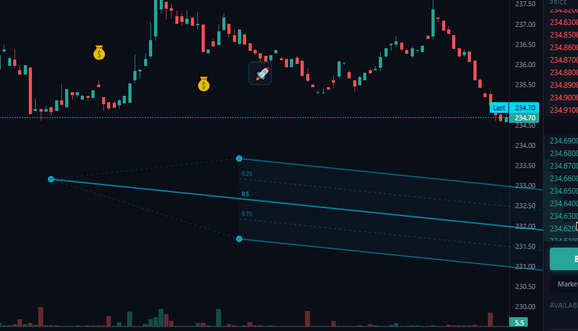
| Fib Channel | 3 | — | Creates a series of parallel lines based on Fibonacci ratios. Three clicks define the base channel (two points for the base line, one for the channel width), and additional lines are drawn at 0.618, 1.0, 1.618, and 2.618 times the channel width. Used to project Fibonacci-based price targets within a trending channel. |
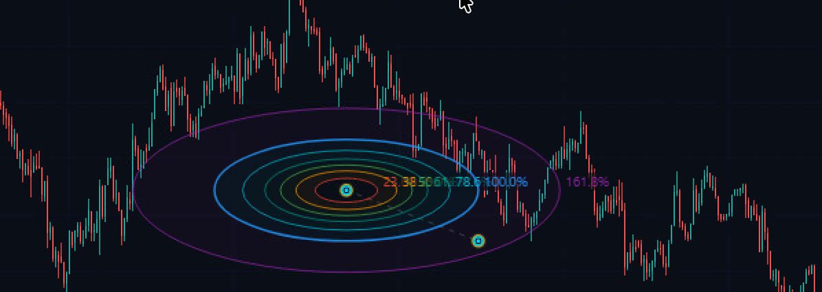
| Fib Circle | 2 | — | Draws concentric circles at Fibonacci-ratio radii from the center point. The first click sets the center, the second sets the radius of the 100% circle. Additional circles are drawn at 23.6%, 38.2%, 50%, 61.8%, and 161.8% of the radius. Identifies circular support/resistance zones around a pivot. |
| Fib Spiral | 2 | — | Draws a logarithmic spiral based on the golden ratio, anchored at the first click point and scaled by the distance to the second point. The spiral expands outward following the Fibonacci sequence. Found throughout nature and financial markets, the Fibonacci spiral can identify curved support/resistance levels that straight lines miss. |
| Fib Wedge | 3 | — | Creates a triangular wedge shape with internal Fibonacci subdivision lines. Three clicks define the wedge vertices, and horizontal lines are drawn at Fibonacci ratios within the wedge. Used to analyze converging price patterns where support and resistance are approaching each other. |
| Trend-Based Fib Time | 3 | — | Combines Fibonacci time analysis with trend direction. Three clicks define a trend-retracement sequence, and vertical lines are projected forward at Fibonacci time ratios measured from the retracement end point. Predicts when the next significant move may occur based on the time proportions of the previous trend cycle. |
| Pitchfan | 3 | — | A hybrid between a pitchfork and a fan. Three clicks define the structure, and multiple lines radiate from the handle through Fibonacci subdivisions of the endpoint range. Combines median-line theory with Fibonacci ratios, providing a fan of potential support/resistance lines that radiate from a single pivot. |
Category 4: Geometric Shapes (12 tools)
Shape tools create geometric forms on the chart canvas, from freehand brushstrokes to precise mathematical shapes. These tools are used for marking zones, highlighting areas of interest, and visual annotation.
| Tool | Clicks | Description |
|---|---|---|
| Brush | Drag | Freehand drawing tool. Press and hold the mouse button, then drag to draw a path in cyan (#00d4ff) with a 2px stroke. Release to finish. The path is recorded as a series of coordinate points and persisted with the chart. Used for circling price patterns, marking support zones freehand, or annotating during live analysis sessions. |
| Highlighter | Drag | A thick, semi-transparent freehand drawing tool (4px stroke at 40% opacity). Functions identically to the Brush but with a wider, translucent stroke that simulates a physical highlighter marker. Used to highlight ranges of price action without obscuring the underlying candles. |
| Rectangle | 2 | Click to set one corner, then click again to set the opposite corner. Creates an axis-aligned rectangle. The standard tool for marking consolidation zones, supply/demand areas, order blocks, and price ranges. Keyboard shortcut: Alt+Shift+R. |
| Rotated Rectangle | 3 | Three clicks: the first two define one edge (and thus the rotation angle), the third sets the width perpendicular to that edge. Creates rectangles at any angle, useful for marking diagonal channels, ascending/descending consolidation zones, and wedge patterns as rectangular areas. |
| Ellipse | 2 | Click to set the center, then click again to set the radius point. Creates an axis-aligned ellipse. Used for circling chart patterns (head and shoulders, cups, rounding tops/bottoms) and for marking areas of interest with a softer boundary than a rectangle. |
| Circle | 2 | Click to set the center, click again to set a point on the circumference. Creates a perfect circle. The equal-radius constraint makes it useful for marking equidistant zones around a pivot point or highlighting time-symmetric patterns. |
| Triangle | 3 | Three clicks define the three vertices. Creates a triangle of any shape and orientation. Used for marking ascending/descending/symmetrical triangle patterns, pennants, and wedge formations. |
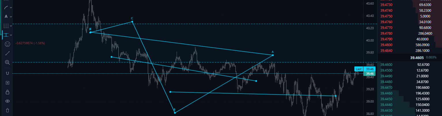
| Polyline | Multi (dblclick to finish) | Click to add points, double-click to finish. Creates an open multi-segment line connecting all points in order. Essential for tracing complex price patterns that cannot be captured by a single trend line — zigzag corrections, Elliott Wave counts, and multi-leg patterns. |
| Curve | 3 | Three clicks: start point, control point (defines the curve), and end point. Creates a quadratic Bezier curve. Used for drawing smooth curved support/resistance lines, parabolic trendlines, and rounding bottom/top patterns. |
| Double Curve | 4 | Four clicks: start, first control point, second control point, and end. Creates an S-shaped cubic Bezier curve. Used for marking complex price patterns with inflection points — extended wave patterns, sinusoidal movements, and multi-phase trends. |
| Arc | 3 | Three clicks define a circular arc: start point, pass-through point, and end point. The arc is computed to pass through all three points. Used for marking cup-shaped patterns, rounding formations, and curved support/resistance. |
| Path | Multi (dblclick to finish) | A smooth freehand drawing tool that creates a connected path through multiple click points with automatic curve smoothing between them. Unlike the Polyline (which uses straight segments), the Path creates flowing curves. Used for tracing the general flow of price action with artistic precision. |
Category 5: Annotations (17 tools)
Annotation tools add text, labels, and visual markers to the chart. These tools are anchored to specific price/time coordinates and move with the chart as you scroll and zoom.
| Tool | Clicks | Shortcut | Description |
|---|---|---|---|
| Text | 1 | Alt+Shift+T |
Places editable text at the clicked position. Used for labeling patterns, marking key levels with descriptions, and adding trade notes directly on the chart. |
| Anchored Text | 1 | — | Text anchored to a specific candle. As you scroll the chart, the text stays attached to its anchor candle rather than floating at a fixed screen position. Used for labeling specific events — earnings, news, or trade entries tied to exact candles. |
| Note | 1 | — | A text box with a border and background, placed at the clicked position. More visually prominent than plain text, the bordered container ensures readability even over busy chart areas. Used for extended annotations, multi-line trade notes, and analysis summaries. |
| Anchored Note | 1 | — | A bordered note box anchored to a specific candle, combining the visual prominence of a Note with the candle-anchoring behavior of Anchored Text. Used for detailed event annotations that must stay associated with specific price bars. |
| Callout | 2 | — | A speech-bubble annotation with a pointer line. The first click sets the point being referenced, the second click positions the callout box. The pointer line connects the annotation to the referenced chart area. Ideal for annotating specific candles or patterns while keeping the text label offset to avoid cluttering. |
| Price Label | 1 | — | A tag-shaped label that displays the price at the clicked position. The label automatically formats the price value and renders with a flag/tag visual style. Used for marking specific price levels with their numeric values prominently displayed. |
| Arrow Up | 1 | — | Places an upward-pointing arrow marker at the clicked position. A quick visual indicator of expected bullish movement. Used in trade journals and analysis markup to indicate buy signals, bullish reversals, or upside targets. |
| Arrow Down | 1 | — | Places a downward-pointing arrow marker at the clicked position. The bearish counterpart to Arrow Up. Used to mark sell signals, bearish reversals, resistance rejections, and downside targets. |
| Flag | 1 | — | Places a flag icon on a vertical pole at the clicked position. Flags are a traditional charting annotation for marking events, milestones, or points of interest. The pole extends downward from the flag, making it a good marker for significant highs. |
| Balloon | 1 | — | An elliptical balloon marker with a string extending downward from the anchor point. Provides a distinctive, attention-grabbing visual marker. Used for highlighting points that need to stand out from other annotations on a busy chart. |
| Signpost | 1 | — | A directional sign on a post, placed at the clicked position. The sign shape provides a natural container for associated text or labels. Used for marking directional bias points — where analysis suggests a specific direction. |
| Pin | 1 | — | A map-pin style marker with a circular head and pointed tail. Places a precise marker at an exact price/time coordinate. The circular head provides a clear visual target while the point indicates the exact referenced position. |
| Table | 1 | — | Inserts a data table at the clicked position. Used for embedding structured data — risk/reward ratios, position sizing calculations, or multi-asset comparison tables — directly onto the chart canvas. |
| Comment | 1 | — | A speech-bubble comment marker. Click to place a comment node that can contain multi-line text. Used for trade journaling — attach detailed notes, reasoning, and post-trade analysis to specific chart points. Comments can serve as a running diary of trading decisions. |
| Price Table | 1 | — | A specialized table pre-configured for price data display. Automatically formats cells for price values with appropriate decimal places. Used for embedding price comparison tables, spread tracking, or level-watching grids on the chart. |
| Flagmark | 1 | — | A filled flag marker on a vertical pole with enhanced visual prominence. Unlike the outlined Flag tool, Flagmark renders with a semi-transparent fill, making it more visible on complex charts. Used for marking critical events that require maximum visibility. |
| Image | 1 | — | Places an image element at the clicked position on the chart. Supports loading external images for chart annotation — logos, reference screenshots, pattern examples, or custom icons that are not available in the built-in tool set. |
Category 6: Patterns (14 tools)
Pattern tools provide specialized multi-point drawing templates for recognized technical analysis patterns. These tools enforce the correct geometric structure of each pattern — you provide the anchor points and the tool ensures the visual representation is accurate.
| Tool | Clicks | Description |
|---|---|---|
| XABCD Pattern | 5 | Draws a five-point harmonic pattern (X, A, B, C, D). Harmonic patterns use Fibonacci ratios between the legs (XA, AB, BC, CD) to identify potential reversal zones. The XABCD framework encompasses Gartley, Bat, Butterfly, and Crab patterns depending on the Fibonacci ratios between the legs. Five clicks define the five pivot points; the tool connects them and displays the pattern structure. |
| Cypher Pattern | 5 | A specific harmonic pattern variant with unique Fibonacci ratio requirements. The Cypher differs from standard XABCD patterns in that the C point extends beyond the A point (BC leg retraces 113-141.4% of XA). Five clicks map the Cypher structure; traders look for the D completion point as a high-probability reversal zone. |
| ABCD Pattern | 4 | The simplest harmonic pattern — four points forming two impulse legs (AB and CD) with a retracement between them (BC). The CD leg should equal the AB leg in both price and time. Four clicks define the structure. Traders enter at the D completion, anticipating a reversal of the same magnitude as the initial AB move. |
| Three Drives | 7 | A seven-point reversal pattern consisting of three consecutive drives to a new high (or low), each at Fibonacci extension levels. The pattern signals exhaustion — the market is making higher highs but with diminishing momentum. Seven clicks trace the three drives and their retracement valleys. |
| Head and Shoulders | 7 | The classic reversal pattern. Seven clicks define the left shoulder, head, right shoulder, and the neckline anchor points. The tool renders the characteristic three-peak structure with the middle peak (head) being the highest. A break below the neckline signals a bearish reversal with a measured move target equal to the head-to-neckline distance. |
| Elliott Impulse (12345) | 6 | Labels a five-wave Elliott impulse sequence with six points (start + 5 wave endpoints). Waves 1, 3, and 5 move in the trend direction; waves 2 and 4 are corrective. The tool enforces the visual structure and labels each wave. Elliott Wave theory states that wave 3 is never the shortest and wave 4 cannot overlap wave 1 territory. |
| Elliott Triangle (ABCDE) | 6 | Labels a five-wave triangle correction (A through E). Triangles are consolidation patterns where each successive wave is smaller than the previous, creating converging trendlines. The tool maps the five subwaves and projects the breakout point. Triangles typically appear in wave 4 or wave B positions within larger Elliott structures. |
| Elliott Triple Combo (WXYXZ) | 6 | Labels a complex corrective structure consisting of three corrective patterns linked by two connecting waves (X). The WXYXZ structure is the most complex Elliott corrective pattern, appearing when the market needs an extended period of consolidation. Six clicks trace the five terminal points of the three linked corrections. |
| Elliott Correction (ABC) | 4 | Labels a three-wave corrective sequence. The simplest Elliott corrective structure: wave A moves against the trend, wave B partially retraces A, and wave C completes the correction. Four clicks define the start point and the endpoints of waves A, B, and C. |
| Elliott Double Combo (WXY) | 4 | Labels a double corrective structure where two corrections (W and Y) are linked by a connecting wave (X). The WXY pattern is more complex than a simple ABC but less so than a triple combo. Four clicks trace the terminal points of the two linked corrections. |
| Cyclic Lines | 2 | Draws equally spaced vertical lines extending from the first click point, with the spacing determined by the distance to the second click. Creates a repeating cycle grid across the chart. Used to identify whether price events occur at regular time intervals — a foundation of cycle analysis theory. |
| Triangle Pattern | 3 | A specialized template for triangle chart patterns (ascending, descending, or symmetrical). Three clicks define the triangle vertices, and the tool renders the pattern with dashed boundary lines and an internal structure showing the expected breakout direction. |
| Time Cycles | 2 | Similar to Cyclic Lines but with additional cycle annotations showing the period duration. Two clicks establish the base cycle period, and the tool projects multiple cycles forward and backward with labeled time intervals. |
| Sine Line | 2 | Draws a sinusoidal wave between two points. The first click sets the start point, the second sets the wavelength and amplitude. The sine curve repeats indefinitely, creating a regular oscillating wave overlay. Used in cycle analysis to test whether price oscillates at a regular frequency — a sine curve that aligns with swing highs and lows confirms a dominant cycle. |
Category 7: Prediction and Measurement (12 tools)
These tools are designed for trade planning, performance measurement, and projection analysis. They go beyond simple markup to provide quantitative data about potential trades and price movements.
| Tool | Clicks | Shortcut | Description |
|---|---|---|---|
| Long Position | 2 | — | Creates a long (buy) position visualization. The first click sets the entry price, the second sets the take-profit level. A green-tinted rectangle shows the profit zone above entry, and a red zone shows the risk below. Automatically calculates and displays the risk/reward ratio, profit potential in both percentage and absolute terms, and the stop-loss distance. Essential for pre-trade planning. |
| Short Position | 2 | — | The bearish counterpart to Long Position. First click sets entry, second click sets the take-profit target below. A red-tinted rectangle shows the profit zone below entry (for shorts, lower is better), and a green zone shows the risk above. Displays the same risk/reward metrics as Long Position but inverted for short selling. |
| Forecast | 2 | — | Projects a potential price path from the current chart position. The first click anchors the forecast to a specific candle, the second click defines the projected direction and magnitude. A dashed projection line extends from the second point, visually indicating the expected future price trajectory. |
| Price Range | 2 | — | Draws two horizontal lines and displays the price difference, percentage change, and number of bars between them. Functions as a vertical ruler for measuring price movement magnitude. Used to quickly measure the size of a swing, the distance between support and resistance, or the magnitude of a breakout. |
| Date Range | 2 | — | Draws two vertical lines and displays the time difference between them in bars, hours, days, and other relevant time units. Functions as a horizontal ruler for measuring time durations. Used to measure the length of consolidation periods, trend durations, and cycle timing. |
| Date and Price Range | 2 | — | Combines Price Range and Date Range into a single rectangular measurement tool. Displays both the price difference and time difference simultaneously, along with the rate of change (price per bar). Creates a dashed rectangle showing the measured area. The complete measurement tool for analyzing both dimensions of price action. |
| Bars Pattern | 2 | — | Captures a range of price bars and creates a reusable pattern template. Two clicks define the start and end of the bar range. The captured pattern can be projected forward as a “ghost” overlay to compare current price action against a historical pattern. Used for identifying recurring patterns and seasonal analogs. |
| Ghost Feed | 2 | — | Overlays a semi-transparent copy of historical price data at a different position on the chart. The ghost data is rendered at 40% opacity with a dashed style, allowing direct visual comparison between two time periods. Used for fractal analysis, seasonal comparison, and self-similarity studies. |
| Projection | 3 | Alt+P |
Three clicks define a base move and a projection origin. The tool projects the magnitude of the base move from the projection origin, creating a measured move target. Based on the principle that price moves tend to repeat in magnitude — if a prior swing was 15%, the next swing from a new base is also projected at 15%. |
| Anchored VWAP | 1 | — | Places a Volume Weighted Average Price line anchored to a specific candle. VWAP calculates the average price weighted by volume from the anchor point forward. Unlike session VWAP (which resets daily), Anchored VWAP lets you measure the “true average price” from any significant event — an earnings candle, a breakout bar, or a trend start. Institutional traders use VWAP as a benchmark; price above Anchored VWAP from a swing low is bullish. |
| Fixed Range Volume Profile | 2 | — | Calculates and displays the volume distribution at each price level within a defined range. Two clicks set the time range, and horizontal bars show how much volume traded at each price within that range. The level with the most volume is the Point of Control (POC) — the “fair value” price where the most agreement occurred. High-volume nodes act as magnets; low-volume nodes act as barriers. |
| Anchored Volume Profile | 1 | — | A single-click Volume Profile that anchors to a specific candle and calculates the volume distribution from that point to the present. Automatically updates as new data arrives. Used to identify the volume-based fair value and support/resistance levels relative to a significant market event. |
Category 8: Icons (3 tools)
| Tool | Clicks | Description |
|---|---|---|
| Emoji | 1 | Places an emoji character at the clicked position. Provides access to the full Unicode emoji set for expressive chart annotation. Traders often use specific emojis as quick shorthand in their analysis — for instance, a rocket for momentum plays or a skull for dead trades. |
| Sticker | 1 | Places a sticker-style graphic at the clicked position. Stickers are larger, more visually prominent than emojis, with a bordered container. Used for marking charts with branded or themed visual elements. |
| Icons | 1 | Places a geometric icon (stars, shapes, symbols) at the clicked position. Provides a set of clean, scalable vector icons for chart annotation. Icons render crisply at any zoom level and integrate cleanly with the chart aesthetic. |
Category 9-15: Utility Controls
The drawing toolbar includes seven utility controls that modify the behavior of the drawing system as a whole rather than creating individual drawings.
| Control | Shortcut | Description |
|---|---|---|
| Measure | Shift+Click |
Activates the measurement cursor. Click two points on the chart to instantly see the price difference, percentage change, bar count, and time elapsed between them. The measurement appears as a temporary overlay that disappears when you click again. Faster than the Info Line for quick measurements — one tool, two clicks, instant data. |
| Zoom In | — | Activates a zoom cursor. Click and drag to define a rectangular region, and the chart zooms to fill that region. Provides precise control over the visible range. The standard scroll-wheel zoom changes the scale uniformly, but the rectangle zoom lets you focus on an exact area of interest. |
| Magnet Mode (3-state) | Alt+M |
Cycles through three magnet states: Off (free placement), Weak (snaps to nearby OHLC values when close), and Strong (always snaps to the nearest OHLC value). When active, drawing anchor points automatically snap to candle open, high, low, or close prices. Eliminates imprecise placement — essential for Fibonacci tools where exact swing high/low anchoring determines the accuracy of all calculated levels. |
| Stay in Drawing Mode | — | When toggled on, completing a drawing does not return you to the cursor mode. Instead, the active drawing tool remains selected, allowing you to immediately place another drawing of the same type. Essential for rapid markup sessions — placing multiple horizontal lines, Fibonacci levels, or annotations without re-selecting the tool each time. |
| Lock All Drawings | — | Prevents all existing drawings from being moved, modified, or deleted. Locked drawings ignore pointer interactions — you can click through them to interact with the chart. Use this after completing your analysis to prevent accidental modifications while trading. |
| Hide All Drawings | — | Toggles the visibility of all drawings on the chart. When hidden, the drawing canvas is transparent and all drawings are invisible. The drawings are not deleted — toggle visibility back on and they reappear exactly as they were. Used for temporarily clearing the visual clutter to see the raw price action. |
| Delete All Drawings | — | Removes all drawings from the current chart. A confirmation step prevents accidental deletion. This is a destructive action — deleted drawings cannot be recovered. Used for starting fresh with a clean chart after an analysis session concludes. |
Section 3: Technical Indicators (90)
The Exchange dApp includes 90 built-in technical indicators, each computed in real-time from the live price feed. Indicators are divided into two display types: overlays that render directly on the price chart (moving averages, bands, cloud formations), and oscillators that render in separate panes below the main chart, each with its own scale.
Every indicator calculation is implemented in pure JavaScript within the Exchange dApp — no server-side computation, no API calls, no delays. The calculations run on the same candle data that feeds the chart, ensuring perfect synchronization.
Moving Averages (15 indicators)
Moving averages are the foundation of trend analysis. They smooth price data over a specified period, revealing the underlying direction by filtering out short-term noise. All moving averages in this category render as overlay lines directly on the price chart.
| Indicator | Type | Default Params | Description |
|---|---|---|---|
| SMA 20 (Simple Moving Average) | Overlay | Period: 20 | The arithmetic mean of the last 20 closing prices. Each candle’s SMA value gives equal weight to all 20 periods. The 20-period SMA is the standard short-term trend indicator. Price above the SMA 20 suggests a short-term uptrend; price below suggests a downtrend. Crossovers between price and the SMA 20 are basic buy/sell signals. |
| SMA 50 | Overlay | Period: 50 | The 50-period Simple Moving Average, representing the intermediate-term trend. The “golden cross” (SMA 50 crossing above SMA 200) and “death cross” (SMA 50 crossing below SMA 200) are among the most widely followed signals in all of technical analysis. |
| SMA 200 | Overlay | Period: 200 | The 200-period Simple Moving Average, the standard long-term trend indicator. Institutional traders worldwide use the 200 SMA as the dividing line between bull and bear markets. Assets trading above their 200 SMA are considered to be in a long-term uptrend. |
| EMA 12/26 (Exponential Moving Average) | Overlay | Periods: 12, 26 | Two Exponential Moving Averages plotted simultaneously. EMAs give more weight to recent prices, making them more responsive to current conditions than SMAs. The 12/26 EMA pair is the same combination used in the MACD indicator. When the faster EMA (12) crosses above the slower EMA (26), it signals bullish momentum; the opposite signals bearish momentum. |
| WMA (Weighted Moving Average) | Overlay | Period: 10 | A moving average where each period is assigned a linearly increasing weight — the most recent period gets the highest weight. More responsive than SMA but smoother than EMA. Used when you want a responsive average without the exponential weighting’s tendency to overreact to single-bar spikes. |
| DEMA (Double Exponential Moving Average) | Overlay | Period: 10 | Applies the EMA formula twice and combines the results to reduce lag. DEMA = 2 * EMA(n) – EMA(EMA(n)). Significantly faster than a standard EMA of the same period. Used by traders who need early trend detection and are willing to accept more false signals in exchange for reduced lag. |
| TEMA (Triple Exponential Moving Average) | Overlay | Period: 10 | Extends the DEMA concept with a third layer of exponential smoothing. TEMA = 3*EMA – 3*EMA(EMA) + EMA(EMA(EMA)). Even lower lag than DEMA, hugging price action very closely. The fastest-responding moving average available, useful for scalping and short-term trading where every bar of lag matters. |
| HMA (Hull Moving Average) | Overlay | Period: 20 | Developed by Alan Hull to virtually eliminate lag while maintaining smoothness. Uses weighted moving averages of different periods combined with a square-root period transformation. The HMA changes direction faster than any other smoothed moving average, making it excellent for identifying trend reversals in real-time. |
| VWMA (Volume Weighted Moving Average) | Overlay | Period: 20 | A moving average where each price is weighted by its corresponding volume. High-volume periods contribute more to the average than low-volume periods. This means the VWMA gravitates toward prices where the most trading activity occurred — the “true” average price that most participants actually traded at. |
| ALMA (Arnaud Legoux Moving Average) | Overlay | 20, 0.85, 6 | Uses a Gaussian distribution curve as the weighting function, with configurable offset (0.85) and sigma (6) parameters. The Gaussian window eliminates the abrupt cutoff of standard moving averages, producing an exceptionally smooth line with minimal lag. The offset parameter controls the balance between smoothness and responsiveness. |
| SMMA (Smoothed Moving Average) | Overlay | Period: 20 | A variation of the EMA that uses a longer effective lookback period. SMMA(N) is equivalent to EMA(2N-1), producing a smoother line than an EMA of the same nominal period. Used when a very smooth trend line is desired that filters out minor fluctuations while still responding to genuine trend changes. |
| McGinley Dynamic | Overlay | Period: 20 | An adaptive moving average that automatically adjusts its speed based on the velocity of price change. When price moves rapidly, the McGinley Dynamic tightens to keep up; when price moves slowly, it smooths further. This self-adjusting behavior reduces the whipsaw signals that plague fixed-period moving averages. |
| Linear Regression | Overlay | Period: 20 | Calculates the least-squares best-fit line through the last N closing prices and plots the end value of that line for each bar. Unlike moving averages that lag behind price, the linear regression value represents where price “should” be based on the current trend. Price above the regression line is bullish; below is bearish. |
| Least Squares MA (LSMA) | Overlay | Period: 25 | Also known as the endpoint moving average. Identical in computation to Linear Regression but often used with a longer default period (25). The name emphasizes its role as a moving average replacement — LSMA can substitute for an SMA in any strategy while providing significantly reduced lag. |
| Guppy Multiple MA | Overlay | 12 MAs | Displays 12 exponential moving averages simultaneously — six “fast” group EMAs (3, 5, 8, 10, 12, 15) and six “slow” group EMAs (30, 35, 40, 45, 50, 60). The visual relationship between the two groups reveals trend strength and trading opportunities. When the fast group fans out above the slow group, the trend is strong and accelerating. Compression between the groups signals consolidation and an imminent breakout. Developed by Daryl Guppy for trend-following in any market. |
Trend Indicators (14 indicators)
Trend indicators identify the direction and strength of the prevailing market trend. Some render on the price chart (overlays), while others appear in separate panes (sub-chart oscillators).
| Indicator | Type | Default Params | Description |
|---|---|---|---|
| Supertrend | Overlay | ATR: 10, Multiplier: 3 | A trend-following overlay that plots a line above price during downtrends (resistance) and below price during uptrends (support). The line color flips between green and red on trend changes. Calculated from ATR (Average True Range) — the multiplier determines how far from price the Supertrend line sits. Clean, unambiguous buy/sell signals make it popular for systematic trading. |
| Ichimoku Cloud | Overlay | 9, 26, 52 | A comprehensive multi-component overlay. The Tenkan-sen (conversion line, 9-period) and Kijun-sen (base line, 26-period) provide moving average-style signals. The Kumo (cloud), formed between Senkou Span A and Senkou Span B, projects 26 periods ahead, showing future support/resistance. The Chikou Span (lagging span) plots the close 26 periods back. Ichimoku provides trend direction, support/resistance levels, momentum, and trading signals — all in a single indicator. |
| Parabolic SAR | Overlay | Start: 0.02, Max: 0.20 | Stop And Reverse — a series of dots plotted above or below price. Dots below price indicate an uptrend; dots above indicate a downtrend. The dots accelerate toward price over time, eventually being “hit” by price which triggers a reversal. Used as a trailing stop mechanism — the SAR dots define where to place your stop-loss, and when price touches the dots, the position is reversed. |
| Williams Alligator | Overlay | 13, 8, 5 | Three smoothed moving averages with different periods and forward shifts: the Jaw (13, shifted 8), Teeth (8, shifted 5), and Lips (5, shifted 3). When the three lines are intertwined, the “Alligator is sleeping” and the market is range-bound. When the lines separate and fan out, the “Alligator is feeding” — a strong trend is in progress. The visual metaphor makes trend identification intuitive. |
| Chande Kroll Stop | Overlay | 10, 1.0, 9 | A volatility-based stop-loss indicator. Calculates stop levels based on ATR, with one stop for long positions and one for short positions. When both stops are below price, the trend is up; when both are above, the trend is down. When price is between the stops, the market is in a neutral zone. Provides adaptive stop-loss levels that adjust to current volatility. |
| EMA Cross | Overlay | 9, 21 | Plots two EMAs (9-period and 21-period) and visually highlights their crossover points. Bullish crossover (fast above slow) generates a buy signal; bearish crossover generates a sell signal. The spacing between the two EMAs indicates trend strength — wider separation means stronger momentum. |
| MA Cross | Overlay | 10, 30 | Similar to EMA Cross but using simple moving averages. Plots two SMAs and highlights their crossovers. The slower response of SMAs compared to EMAs produces fewer but potentially more reliable crossover signals. Used in strategies that prioritize signal quality over speed. |
| Zig Zag | Overlay | 5% | Connects significant swing highs and swing lows, filtering out movements smaller than the threshold (5%). Creates a clean zigzag line that highlights only the major swings. Not a predictive indicator — it is a retrospective filter that simplifies price action for pattern identification. The last segment is always tentative and may be redrawn as new data arrives. |
| ADX (Average Directional Index) | Oscillator | Period: 14 | Measures trend strength on a 0-100 scale regardless of direction. ADX below 20 indicates a weak or absent trend (range-bound market); above 25 indicates a trending market; above 50 indicates an exceptionally strong trend. Does not indicate trend direction — only its strength. Used to filter other indicators: only trade moving average crossovers when ADX confirms a trending environment. |
| Directional Movement | Oscillator | Period: 14 | Plots +DI (positive directional indicator) and -DI (negative directional indicator). When +DI is above -DI, upward movement dominates; when -DI is above +DI, downward movement dominates. Crossovers between +DI and -DI generate buy/sell signals. Often used in conjunction with ADX — trade DI crossovers only when ADX indicates a strong trend. |
| Aroon | Oscillator | Period: 25 | Measures how recently the highest high and lowest low occurred within the lookback period. Aroon Up measures bars since the last 25-period high; Aroon Down measures bars since the last 25-period low. Both oscillate between 0 and 100. Aroon Up above 70 with Aroon Down below 30 signals a strong uptrend. Crossovers between the two lines signal trend changes. |
| Vortex Indicator | Oscillator | Period: 14 | Plots two oscillating lines: +VI (positive vortex) and -VI (negative vortex). +VI measures the strength of upward price movement relative to the true range; -VI does the same for downward movement. Crossovers signal trend changes. The Vortex Indicator is designed to capture the start of new trends and can identify trend reversals before they become obvious on price charts. |
| Trend Strength | Oscillator | Period: 14 | A composite trend strength measurement that normalizes directional movement data into a single oscillating value. Higher readings indicate stronger trends regardless of direction. Used as a filter — enable trend-following strategies when Trend Strength is above the threshold and switch to mean-reversion strategies when it is below. |
| Choppiness Index | Oscillator | Period: 14 | Measures whether the market is trending or choppy (range-bound) on a 0-100 scale. High values (above 61.8) indicate a choppy, range-bound market; low values (below 38.2) indicate a trending market. The thresholds are deliberately set at Fibonacci levels. Used to avoid trend-following strategies during choppy periods and avoid range trading during trending periods. |
Oscillators (28 indicators)
Oscillators measure momentum, overbought/oversold conditions, and the rate of price change. They all render in separate sub-panes below the main chart, each with its own value scale.
| Indicator | Default Params | Description |
|---|---|---|
| RSI (Relative Strength Index) | Period: 14 | The most widely used oscillator. RSI oscillates between 0 and 100, measuring the speed and magnitude of recent price changes. Readings above 70 indicate overbought conditions (potential reversal down); below 30 indicates oversold (potential reversal up). Divergence between RSI and price — when price makes a new high but RSI does not — is one of the most reliable reversal signals in technical analysis. |
| MACD (Moving Average Convergence Divergence) | 12, 26, 9 | Plots the difference between two EMAs (12 and 26 period) as a line, with a 9-period EMA of that line as the signal line, and a histogram showing the difference between the two. MACD crossovers (MACD line crossing the signal line) are buy/sell signals. The histogram turning positive after being negative indicates building bullish momentum. One of the most versatile indicators — trend, momentum, and signal in one. |
| Stochastic | %K: 14, Smooth: 3, %D: 3 | Compares the closing price to the price range over the lookback period. %K measures where the close sits within the high-low range (0-100); %D is a 3-period SMA of %K. Readings above 80 are overbought; below 20 are oversold. %K crossing above %D in the oversold zone is a buy signal; crossing below in the overbought zone is a sell signal. |
| Stochastic RSI | 14, 14, 3, 3 | Applies the Stochastic formula to RSI values instead of price. This creates an oscillator of an oscillator — more sensitive and faster-moving than either RSI or Stochastic alone. Ranges from 0 to 1 (or 0-100 when scaled). Extremely useful for identifying short-term overbought/oversold conditions within a longer-term trend established by RSI. |
| Williams %R | Period: 14 | Measures where the close is relative to the highest high over the lookback period, oscillating between -100 and 0. Functionally the inverse of the Stochastic %K. Readings above -20 indicate overbought; below -80 indicate oversold. Despite its simplicity, Williams %R is highly effective at identifying potential turning points. |
| CCI (Commodity Channel Index) | Period: 20 | Measures the deviation of the typical price from its statistical mean, scaled by the mean absolute deviation. Oscillates without fixed bounds but typically ranges between -200 and +200. Values above +100 indicate the asset is overbought relative to its average; below -100 indicates oversold. Originally developed for commodities but equally effective on crypto assets. |
| Rate of Change (ROC) | Period: 9 | The percentage change in price over the last N periods. ROC = ((Close – Close_N) / Close_N) * 100. A pure momentum indicator — positive ROC means price is higher than N periods ago; negative means lower. Zero-line crossovers signal momentum shifts. Extreme readings indicate potential exhaustion. |
| Momentum | Period: 10 | The absolute price difference between the current close and the close N periods ago. Momentum = Close – Close_N. Simpler than ROC (no percentage normalization). Positive momentum means price is rising; negative means falling. The rate of change of momentum itself indicates acceleration/deceleration of the trend. |
| Awesome Oscillator | 5, 34 | The difference between the 5-period and 34-period simple moving averages of the median price (H+L)/2. Displayed as a histogram that changes color based on whether the current bar is higher or lower than the previous bar. Twin Peaks (two lows in the histogram separated by a bar below zero) and saucer setups are classic AO trading signals. |
| Accelerator Oscillator | 5, 34 | The difference between the Awesome Oscillator and its 5-period SMA. Measures the acceleration of momentum — positive values mean momentum is accelerating upward, negative means it is accelerating downward. A leading indicator that changes direction before the AO, which in turn changes before price. |
| Balance of Power | Smooth: 14 | Measures the balance between buyers and sellers by analyzing the position of the close relative to the open, normalized by the high-low range. BOP = (Close – Open) / (High – Low). Positive values indicate buying dominance; negative indicate selling dominance. The smoothing filter reduces noise for clearer signal interpretation. |
| Chande Momentum | Period: 9 | Oscillates between -100 and +100 based on the ratio of total up movement to total down movement. Unlike RSI (which is always positive), CMO can be negative, providing a symmetric measure of momentum. Readings above +50 or below -50 indicate strong momentum; zero-line crossovers signal direction changes. |
| Connors RSI | 3, 2, 100 | A composite indicator combining three components: a short-term RSI (period 3), the streak length of consecutive up/down closes (period 2), and the percentile rank of the current day’s return (period 100). The average of the three components produces a 0-100 value that is more responsive than standard RSI. Used primarily for short-term mean reversion — extreme readings tend to revert quickly. |
| Coppock Curve | 10, 14, 11 | A long-term momentum indicator calculated as the WMA of the sum of the 14-month and 11-month ROC. Originally designed to identify major market bottoms. A buy signal occurs when the Coppock Curve turns up from below zero. One of the few indicators specifically designed for identifying the start of major bull markets. |
| Detrended Price Oscillator | Period: 20 | Removes the trend from price data, leaving only the cyclical component. DPO = Close – SMA(N/2 + 1 periods ago). By removing the trend, the DPO isolates price cycles and makes it easier to identify the dominant cycle length. Peaks and troughs in the DPO correspond to overbought/oversold conditions within the current cycle. |
| Ease of Movement | Period: 14 | Relates price movement to volume, measuring how easily price is moving. EOM = ((High+Low)/2 – (PrevHigh+PrevLow)/2) / (Volume/(High-Low)). High positive values indicate price is rising easily on low volume (bullish); high negative values indicate price is falling easily. Values near zero indicate either high volume with little price movement or a balanced market. |
| Elder’s Force Index | Period: 13 | Combines price change and volume into a single force measurement. Force = (Close – PrevClose) * Volume. Positive force means buyers are in control; negative means sellers dominate. The magnitude indicates the power behind the move. A 13-period EMA smoothing produces clean signals: zero-line crossovers indicate trend changes; divergence signals reversals. |
| Fisher Transform | Period: 9 | Transforms the price distribution into a Gaussian normal distribution, making extreme readings sharper and more distinct. The Fisher Transform creates clear turning points with precise peaks and troughs that correspond to price reversals. Crossing above/below zero provides buy/sell signals. The mathematical transformation ensures that reversal signals are less ambiguous than those from raw oscillators. |
| Know Sure Thing (KST) | 10, 15, 20, 30 | A weighted sum of four smoothed rate-of-change values at different periods. Combines momentum across multiple time frames into a single line with a signal line. KST crossing above its signal line from below is bullish; crossing below is bearish. By combining four different momentum readings, KST confirms trends across multiple time horizons simultaneously. |
| Price Oscillator | 12, 26 | The percentage difference between two moving averages. Essentially a MACD expressed as a percentage, making it comparable across different assets regardless of price level. Positive readings mean the short-term average is above the long-term average (bullish); negative readings are bearish. |
| Relative Vigor (RVGI) | Period: 10 | Measures the conviction of a price move by comparing the close-to-open range (vigor) against the high-to-low range (total range). In an uptrend, closes tend to be above opens, producing positive RVGI. A signal line crossover system (similar to MACD) provides buy/sell signals. Unique in its use of open data, which most oscillators ignore. |
| SMI Ergodic | 5, 20, 5 | A double-smoothed momentum oscillator based on the True Strength Index. The SMI Ergodic measures the relationship between the current close and the midpoint of the high-low range, double-smoothed with EMAs. Produces a main line and a signal line. Zero-line crossovers indicate trend direction; signal-line crossovers generate trade entries. |
| True Strength Index (TSI) | 25, 13, 13 | A double-smoothed momentum indicator. TSI applies two exponential smoothings to the price change, reducing noise while preserving the signal. Ranges roughly between -100 and +100. Zero-line crossovers indicate the overall trend; signal-line crossovers provide entry timing. Divergence between TSI and price is a reliable reversal signal. |
| TRIX | 15, 9 | The percentage change of a triple-smoothed EMA. Three layers of exponential smoothing filter out all but the most significant price movements. TRIX oscillates around zero — positive values indicate the triple-smoothed trend is rising, negative means falling. Zero-line crossovers are very clean but come with significant lag. Best for identifying major trend changes rather than short-term signals. |
| Ultimate Oscillator | 7, 14, 28 | Combines buying pressure across three time frames (7, 14, and 28 periods) into a single 0-100 oscillator. By using three periods, the Ultimate Oscillator avoids the false signals that single-period oscillators generate. Buy signals require bullish divergence with the oscillator below 30 and then breaking above the divergence high. The multi-period design makes it less susceptible to whipsaws. |
| LinReg Slope | Period: 14 | Plots the slope of the linear regression line over the lookback period. Positive slope means the regression line is rising (bullish trend); negative slope means falling. The magnitude indicates trend steepness. Zero-line crossovers mark the exact point where the statistical trend changes direction. |
| Correlation Coefficient | Period: 20 | Measures the correlation between price and time over the lookback period. Values near +1 indicate a strong positive linear trend; near -1 indicates a strong negative linear trend; near 0 indicates no linear trend. Useful for confirming whether a perceived trend is statistically significant. |
| Rank Correlation | Period: 14 | Spearman’s rank correlation coefficient between the price values and their time indices. Unlike the standard correlation coefficient, rank correlation is robust to outliers and non-linear relationships. Values near +1 mean price has been consistently rising in order; near -1 means consistently falling. |
Volume Indicators (11 indicators)
Volume indicators analyze trading activity — the quantity of shares or contracts traded — to confirm price movements and identify potential reversals. The principle: strong trends should be confirmed by volume; price movements on low volume are suspect.
| Indicator | Type | Default Params | Description |
|---|---|---|---|
| Volume | Oscillator | — | Displays the raw trading volume as a bar chart in a sub-pane. Each bar corresponds to the volume of the matching candle on the price chart. The most basic volume visualization — high bars indicate periods of intense trading activity. Volume spikes on breakouts confirm their validity; breakouts on low volume are more likely to fail. |
| On Balance Volume (OBV) | Oscillator | — | A cumulative volume indicator. On up days, the day’s volume is added to the running OBV total; on down days, it is subtracted. The theory: volume precedes price. If OBV is rising while price is flat, accumulation is occurring (bullish). If OBV is falling while price is flat, distribution is occurring (bearish). Divergence between OBV and price is a powerful leading signal. |
| Accumulation/Distribution (A/D) | Oscillator | — | A cumulative volume-based indicator that uses the close’s position within the bar’s range to weight volume. If the close is in the upper half of the bar, the volume is counted as accumulation; in the lower half, as distribution. More nuanced than OBV because it considers where within the bar the close occurred, not just whether it was up or down. |
| Chaikin Money Flow (CMF) | Oscillator | Period: 20 | The sum of Accumulation/Distribution values over the period, divided by the sum of volume. Oscillates between -1 and +1. Positive CMF indicates net buying pressure (accumulation); negative indicates net selling pressure (distribution). CMF above zero for an extended period signals institutional accumulation; persistent negative readings signal distribution. |
| Chaikin Oscillator | Oscillator | 3, 10 | The MACD of the Accumulation/Distribution line — specifically, the 3-period EMA of A/D minus the 10-period EMA of A/D. Measures the momentum of accumulation/distribution. Positive and rising means accumulation is accelerating; negative and falling means distribution is accelerating. Zero-line crossovers signal shifts between accumulation and distribution phases. |
| Klinger Oscillator | Oscillator | 34, 55, 13 | A volume-based oscillator that uses volume force (volume weighted by trend direction and magnitude) to measure long-term money flow while detecting short-term fluctuations. The 34 and 55 period EMAs of volume force are differenced, with a 13-period signal line. Zero-line crossovers identify the dominant trend; signal-line crossovers provide entry timing. |
| Money Flow Index (MFI) | Oscillator | Period: 14 | Often described as “volume-weighted RSI.” MFI incorporates both price and volume data, ranging from 0 to 100. Readings above 80 are overbought; below 20 are oversold. Because MFI includes volume, its overbought/oversold signals are considered more reliable than pure-price oscillators — a price move confirmed by volume is more likely to be sustained. |
| Net Volume | Oscillator | — | Calculates up-volume minus down-volume for each bar. Positive net volume means more volume occurred on up-ticks; negative means more occurred on down-ticks. Displayed as a histogram — green bars for positive net volume, red for negative. A clean visual representation of whether buying or selling volume dominates each period. |
| Price Volume Trend (PVT) | Oscillator | — | A cumulative indicator that adds or subtracts a portion of volume based on the percentage price change. PVT = PrevPVT + Volume * ((Close – PrevClose) / PrevClose). Unlike OBV (which adds or subtracts the entire volume), PVT proportionally weights volume by the size of the price change. This produces a more accurate representation of the volume-price relationship. |
| Volume Oscillator | Oscillator | 5, 10 | The percentage difference between two moving averages of volume. Positive values indicate short-term volume is above the longer-term average (increasing activity); negative values indicate declining activity. Used to confirm breakouts — a positive Volume Oscillator during a price breakout validates the move. |
| VWAP (Volume Weighted Average Price) | Overlay | Session reset | The cumulative average price weighted by volume, resetting each trading session. VWAP represents the “true” average price at which trading occurred. Institutional traders benchmark their execution against VWAP — buying below VWAP is considered favorable; selling above it is favorable. Price above VWAP indicates bullish intraday sentiment; below indicates bearish. |
Volatility Indicators (15 indicators)
Volatility indicators measure the rate and magnitude of price fluctuations. They help traders set appropriate stop-losses, identify breakout potential, and gauge market conditions. Some are overlays (bands and channels), others are sub-chart oscillators.
| Indicator | Type | Default Params | Description |
|---|---|---|---|
| Bollinger Bands | Overlay | Period: 20, StdDev: 2 | Three lines: a 20-period SMA (middle band) with upper and lower bands at 2 standard deviations above and below. The bands expand during volatile periods and contract during quiet periods. Price touching the upper band suggests overbought; touching the lower band suggests oversold. The “Bollinger Squeeze” — when the bands contract to their tightest width — signals an imminent volatility breakout. |
| BB %B | Oscillator | 20, 2 | Quantifies where price sits within the Bollinger Bands as a percentage. %B = (Close – Lower Band) / (Upper Band – Lower Band). Values above 1.0 mean price is above the upper band; below 0 means price is below the lower band; 0.5 means price is at the middle band. Converts the visual Bollinger Band reading into a precise numeric oscillator. |
| BB Width | Oscillator | 20, 2 | Measures the width of the Bollinger Bands as a percentage of the middle band. BB Width = (Upper Band – Lower Band) / Middle Band. Rising BB Width indicates increasing volatility; falling indicates decreasing volatility. Extreme lows in BB Width signal the Bollinger Squeeze — a powerful setup for volatility breakout traders. |
| ATR (Average True Range) | Oscillator | Period: 14 | The moving average of the True Range (the greatest of: current high minus low, absolute value of high minus previous close, absolute value of low minus previous close). ATR measures pure volatility without direction. Used for setting stop-losses (e.g., 2x ATR below entry), position sizing (risk a fixed amount divided by ATR), and identifying volatility expansions. The foundational volatility metric. |
| Keltner Channels | Overlay | EMA: 20, ATR: 10 | Three lines: a 20-period EMA (center) with upper and lower bands at 10-period ATR multiples above and below. Unlike Bollinger Bands (which use standard deviation), Keltner Channels use ATR, making them less sensitive to individual price spikes. The TTM Squeeze strategy identifies when Bollinger Bands are inside Keltner Channels — signaling extremely compressed volatility about to explode. |
| Donchian Channels | Overlay | Period: 20 | The highest high and lowest low over the last 20 periods, with a midline at their average. The upper channel acts as resistance; the lower channel acts as support. Price breaking above the Donchian upper channel is a breakout buy signal; breaking below is a sell signal. The classic “Turtle Trading” system used 20-day Donchian channel breakouts as its primary entry signal. |
| Envelopes | Overlay | 20, 2.5% | A moving average with upper and lower bands set at a fixed percentage above and below. Simpler than Bollinger Bands — the band width is constant rather than varying with volatility. Price touching the upper envelope suggests overbought; touching the lower suggests oversold. The fixed percentage makes it useful for identifying consistent overextension levels in assets with stable volatility. |
| Price Channel | Overlay | Period: 20 | Similar to Donchian Channels but with configurable offset and display options. Shows the highest high and lowest low over the period as channel boundaries. Price riding the upper channel indicates a strong uptrend; riding the lower channel indicates a strong downtrend. Breakouts beyond the channel trigger trend-following entries. |
| Std Error Bands | Overlay | 20, 2 | Standard Error Bands plot the standard error of the linear regression at each point, creating bands that show the statistical confidence interval around the regression trend. Narrower bands indicate a strong, consistent trend; wider bands indicate a weaker, more erratic trend. More statistically rigorous than Bollinger Bands for trend-based analysis. |
| MA Channel | Overlay | Period: 20 | A channel constructed from the highest and lowest values of a moving average over a specified period. Creates a smoothed envelope that adapts to the trend. The channel width reflects recent trend consistency — a narrow MA Channel indicates a steady trend; a wide channel indicates choppy conditions. |
| Standard Deviation | Oscillator | Period: 20 | Plots the standard deviation of closing prices over the lookback period. Rising standard deviation means volatility is increasing; falling means it is decreasing. Extreme high readings mark potential volatility peaks (often coinciding with price climaxes); extreme low readings mark potential volatility troughs (often preceding breakouts). |
| Historical Volatility | Oscillator | Period: 20 | The annualized standard deviation of logarithmic returns, expressed as a percentage. Historical Volatility provides a statistically meaningful measure of how volatile the asset has been — 80% HV means the asset’s annualized price range is approximately 80% of its current price. Used for options pricing, position sizing, and comparing volatility across different assets. |
| Chaikin Volatility | Oscillator | 10, 10 | Measures the rate of change of the high-low spread (the EMA of the high-low range). Rising Chaikin Volatility means bars are getting wider (increasing intra-bar volatility); falling means bars are narrowing. A sharp increase often precedes trend reversals — increased volatility at a price extreme signals potential exhaustion. |
| Relative Volatility Index (RVI) | Oscillator | Period: 10 | Similar to RSI in formula, but applied to standard deviation rather than price. RVI measures the direction of volatility — whether volatility is expanding or contracting. Readings above 50 indicate increasing volatility; below 50 indicates decreasing volatility. Often used as a filter for other indicators rather than as a standalone signal generator. |
| Mass Index | Oscillator | 10, 25 | Measures the narrowing and widening of the high-low range to identify trend reversals. The Mass Index sums the ratio of two EMAs of the high-low range over 25 periods. The key signal is the “reversal bulge” — when the Mass Index rises above 27 and then falls back below 26.5, a trend reversal is likely regardless of the current direction. |
Support/Resistance Indicators (2 indicators)
| Indicator | Type | Default Params | Description |
|---|---|---|---|
| Pivot Points | Overlay | Standard | Calculates the central Pivot Point (PP) and three levels of Support (S1, S2, S3) and Resistance (R1, R2, R3) from the previous period’s high, low, and close. PP = (H+L+C)/3. These levels are used by floor traders and institutions worldwide as reference points for intraday trading. Price above the PP is considered bullish; below is bearish. S1/R1 are the first target levels. |
| 52-Week High/Low | Overlay | — | Displays horizontal lines at the 52-week (or equivalent period) highest high and lowest low. These levels represent the extreme boundaries of the asset’s annual range. A breakout above the 52-week high is one of the most powerful bullish signals — the asset is trading at prices no one has seen in a year, suggesting strong demand. Conversely, breaking below the 52-week low signals extreme weakness. |
Price Indicators (5 indicators)
| Indicator | Type | Default Params | Description |
|---|---|---|---|
| Typical Price | Overlay | (H+L+C)/3 | The average of the high, low, and close for each bar. Typical Price provides a single representative value for each period that accounts for the full range and the closing position. Used as the input for many other indicators (CCI, for example) and as a smoother alternative to the closing price for trend analysis. |
| Median Price | Overlay | (H+L)/2 | The midpoint of each bar’s range: (High + Low) / 2. Represents the center of the bar’s trading range, ignoring where the bar opened and closed. Useful for identifying the equilibrium price of each period and for constructing moving averages that respond to the full range rather than just the close. |
| Average Price | Overlay | (O+H+L+C)/4 | The average of all four OHLC values. Average Price accounts for the open, which Typical Price and Median Price ignore. Provides the most complete single-value representation of each bar’s entire trading activity. The difference between Average Price and Typical Price reveals the gap between the opening dynamics and the rest of the session. |
| Spread (H-L) | Oscillator | — | The raw high-to-low spread for each bar, displayed as a sub-chart histogram. Measures the intra-bar volatility — wide bars produce high spread values, narrow bars produce low values. A simple but effective visualization of volatility that is easier to read than ATR for identifying specific bars with unusual range expansion. |
| Accumulative Swing Index (ASI) | Oscillator | Limit: 12 | A cumulative indicator based on the Swing Index, which uses the OHLC values of the current and previous bars to assign a numeric value to each bar’s swing potential. The ASI accumulates these swing values over time. Trendlines drawn on the ASI can confirm or diverge from price-based trendlines — divergence suggests the price trend is weakening. Breakouts in the ASI often precede breakouts in price. |
Section 4: Multi-Pane System
Every oscillator-type indicator in the Exchange dApp automatically creates its own dedicated chart pane below the main price chart. This multi-pane architecture ensures that each indicator has its own y-axis scale and visual space — no overcrowding, no scaling conflicts.
Synchronized time scales: All panes share the same x-axis (time scale). Scroll or zoom the main chart and every oscillator pane scrolls and zooms in lockstep. The crosshair extends vertically through all panes, so hovering over a candle on the price chart simultaneously shows the corresponding values on every active oscillator.
Pane management: Each pane can be individually resized by dragging its border, collapsed to a minimal header (saving screen space while keeping the indicator active), or removed entirely by toggling it off in the Indicators dialog. Pane order follows the order in which indicators were activated, with the most recently added indicator appearing at the bottom.
Performance considerations: Each active indicator pane runs its own calculation loop on every chart update. While the JavaScript engine handles dozens of indicators efficiently, traders should be aware that activating 20+ oscillators simultaneously may impact performance on lower-end devices. The computation is pure client-side — no server round-trips — so the performance ceiling is your device’s CPU.
Section 5: Market Depth Chart
The Exchange dApp includes a dedicated canvas-based market depth visualization that renders the current order book as a stepped area chart. The depth chart provides a visual representation of supply and demand at every price level.
Rendering: The depth chart uses a direct canvas rendering pipeline (not a charting library) for maximum performance. Bid orders are displayed as a green stepped area on the left side; ask orders are displayed as a red stepped area on the right side. The midpoint between the best bid and best ask is centered on the chart.
Multi-resolution zoom: The toolbar above the depth chart provides zoom controls and preset range buttons. You can zoom into the immediate spread area to see fine-grained liquidity around the current price, or zoom out to see the full depth of the order book across the entire price range. Zoom operates smoothly with mouse wheel support.
Real-time statistics: The depth chart toolbar displays live statistics including the current spread (in both absolute and percentage terms), total bid volume, total ask volume, and the bid/ask ratio. These values update in real-time as the order book changes.
Bid/Ask volume display: Hovering over the depth chart shows a tooltip with the exact price level and cumulative volume at that point. The stepped area visualization makes it easy to identify “walls” — large orders at specific price levels that act as support (bid walls) or resistance (ask walls). The visual weight of each step indicates the order size at that price level.
Section 6: Mobile Touch Support
Every drawing tool in the Exchange dApp is fully operational on touch devices. The touch interaction system adapts the desktop mouse-based workflow to finger-based input.
Touch-optimized drawing tools: On touch devices, single-tap replaces single-click for placing anchor points. The system accounts for finger imprecision by using a 44px minimum touch target around interactive elements — exceeding the standard 48px iOS/44px Android accessibility guidelines. Drawing previews update smoothly during touch-move events.
Long-press for context menu: A long-press (press and hold for approximately 500ms) on the chart opens a context menu with drawing options, including tool selection, drawing properties, and delete. This replaces the right-click context menu available on desktop. The long-press timer is carefully tuned to avoid interfering with normal scrolling gestures.
Gesture handling: The drawing system distinguishes between chart navigation gestures (single-finger pan, pinch-to-zoom) and drawing gestures. When a drawing tool is active, single-finger taps place anchor points; when no drawing tool is active, single-finger drags pan the chart. Multi-touch gestures (pinch) are always interpreted as zoom/pan regardless of the active tool. This ensures that chart navigation remains fluid even during drawing sessions.
Brush and freehand tools: Freehand tools (Brush, Highlighter, Path) use touch-move events for drawing, creating a natural “finger painting” experience. The coordinate sampling rate is optimized for smooth curves without excessive point density.
Section 7: Keyboard Shortcuts Reference
The Exchange dApp provides keyboard shortcuts for rapid tool selection, eliminating the need to navigate the toolbar during analysis sessions. All shortcuts use the Alt key as the modifier.
| Shortcut | Action | Category |
|---|---|---|
Ctrl+Shift+H |
Crosshair cursor (return to default mode) | Cursor |
Alt+T |
Trend Line | Trend Lines |
Alt+H |
Horizontal Line | Trend Lines |
Alt+V |
Vertical Line | Trend Lines |
Alt+F |
Fibonacci Retracement | Gann & Fibonacci |
Alt+Shift+P |
Pitchfork | Gann & Fibonacci |
Alt+Shift+R |
Rectangle | Shapes |
Alt+Shift+T |
Text | Annotations |
Alt+P |
Projection | Prediction & Measurement |
Alt+M |
Cycle Magnet Mode (Off → Weak → Strong) | Utility |
Shift+Click |
Quick Measure between two points | Utility |
Escape |
Cancel current drawing / deselect tool | General |
Delete |
Delete selected drawing | General |
Alt+H to rapidly place multiple horizontal support/resistance levels without touching the toolbar. When finished, press Ctrl+Shift+H to return to the crosshair.Conclusion
The GRIDNET OS Exchange dApp packs an extraordinary volume of analytical capability into a single decentralized application. With 12 chart types for every visualization preference, 87 drawing tools spanning cursors through complex harmonic patterns, and 90 technical indicators covering every major school of technical analysis — from Fibonacci to Elliott Wave, from simple moving averages to triple-smoothed momentum oscillators — this is a charting platform that stands alongside professional desktop applications.
What makes it remarkable is not just the breadth of tools but the architectural philosophy: every calculation runs client-side in pure JavaScript, every drawing persists per trading pair, and every indicator computes in real-time from the live Hyperliquid data feed. There are no subscription tiers, no premium-only indicators, no server-side computation dependencies. The full toolkit is available to every GRIDNET OS user, running inside the decentralized operating system’s native window manager.
For traders migrating from centralized charting platforms, the transition is seamless — the same tools, the same keyboard shortcuts, the same analytical workflows. For new traders, this reference serves as both a learning guide and a comprehensive index of what is available.
The Exchange dApp continues to evolve. The drawing engine, the indicator library, and the multi-pane system are all active areas of development within the GRIDNET OS project. This documentation will be updated as new tools and capabilities are added.